As Modo reached it’s 25th year of operations they wanted to update the look of the company while keeping the personable feel that members love.
I worked with the Marketing Director over the course of the project to move from the hand-drawn, casual style of the previous branding to a cleaner, scalable brand.
-
Individual freelance project
-
Modo Cooperative
-
Branding
Illustration
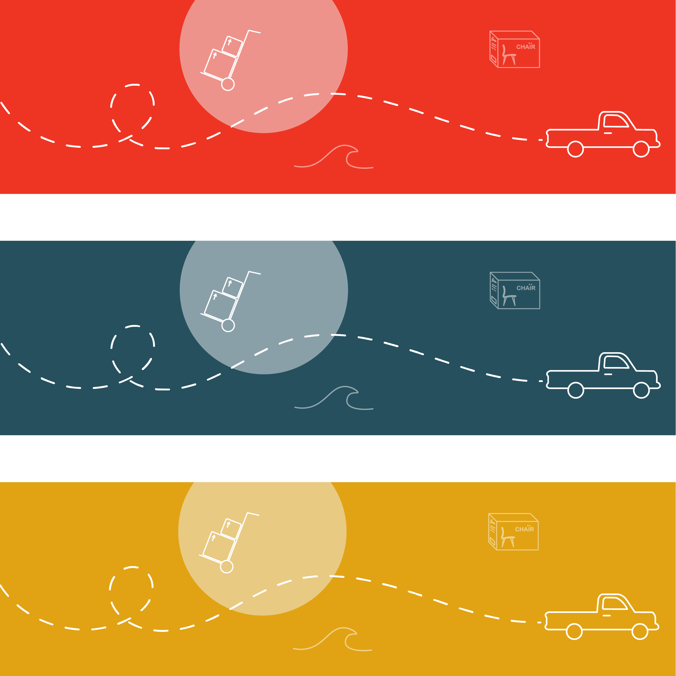
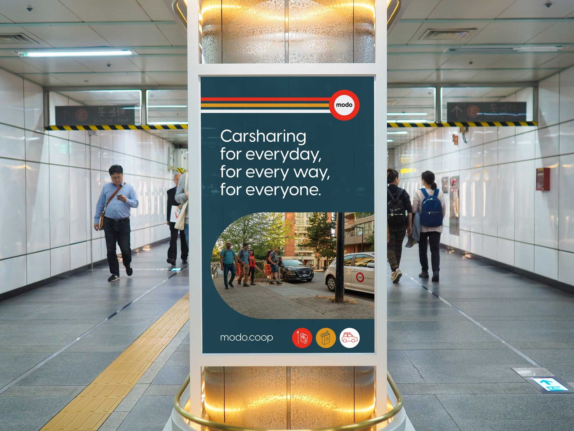

Modo wanted to explore new additional brand colours that would better represent British Columbia, the province they were founded and operate in. The new colours needed to work alongside the iconic Modo Red that members and the community recognise. To launch the new colours Modo wanted a special edition 25th anniversary badge design inspired by scouting/provincial park patches. These were made into badges and stickers to celebrate with the Modo community.


Limited edition merch inspired by the 90s, the decade Modo was founded, including a band inspired tee featuring the first Modo vehicle.


Modo uses a lot of iconography within their branding and wanted to present a cleaner style with an expanded range of icons.